I was challenged to assess an existing festival identity and create a new brand kit that better suits the values of the festival. I chose a local monthly art fair in Cincinnati called Art on Vine because I loved its community focus and playful style.
Festival Rebrand: Art on Vine
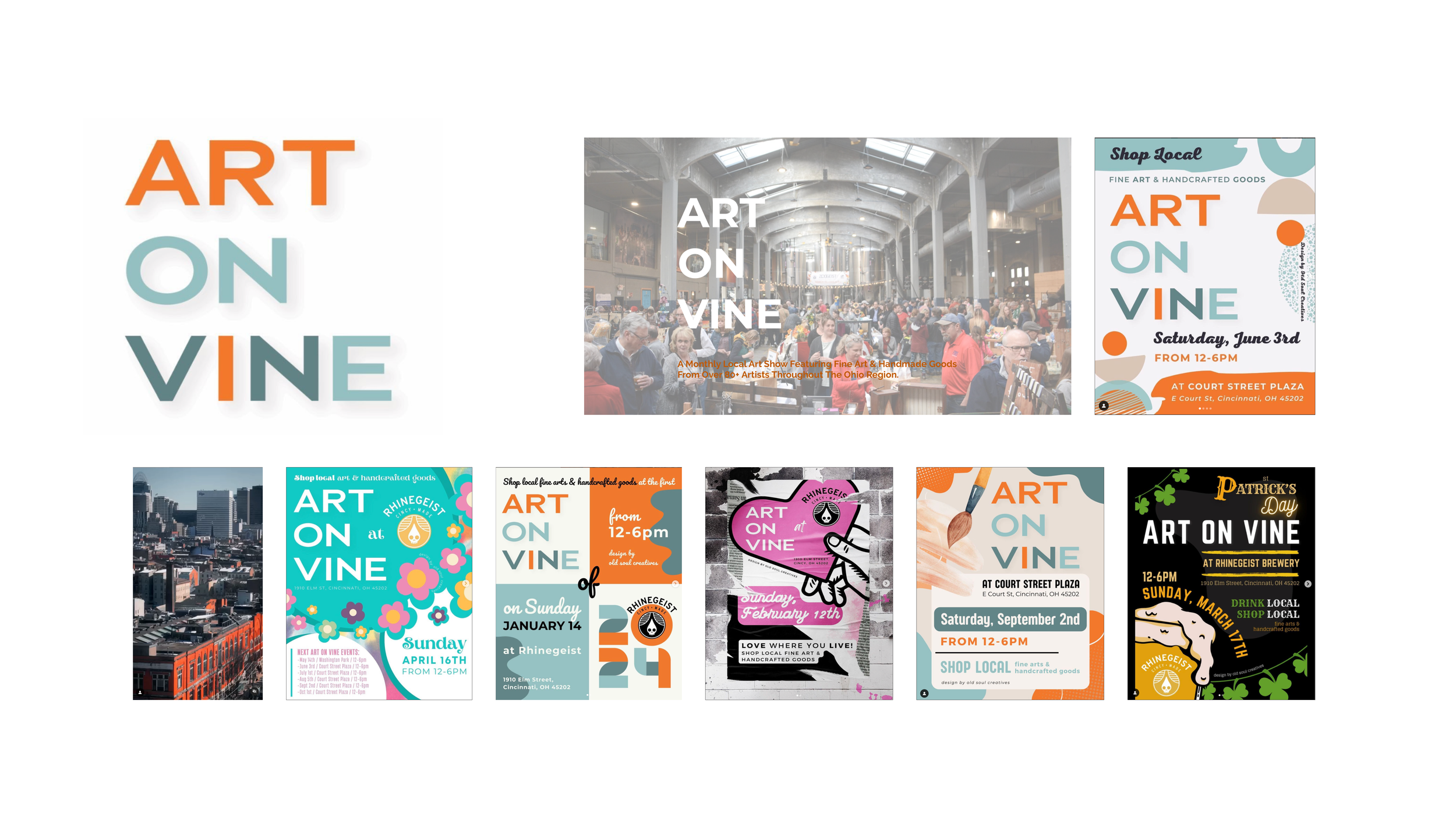
Current Branding

My Trip to Art on Vine
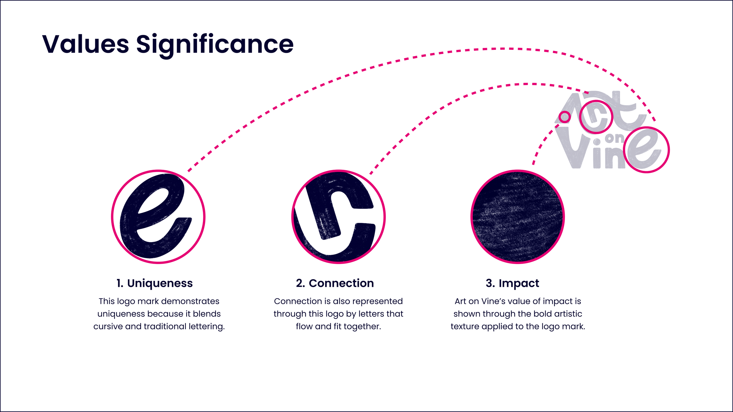
Based on my own audit of the brand, I chose three core values to represent through the wordmark: uniqueness, connection, and impact. These values of the festival are represented through the bold elements of these sketches as well as their elements that connect and interlock.
Wordmark Sketching and Ideation


Wordmark Iterations
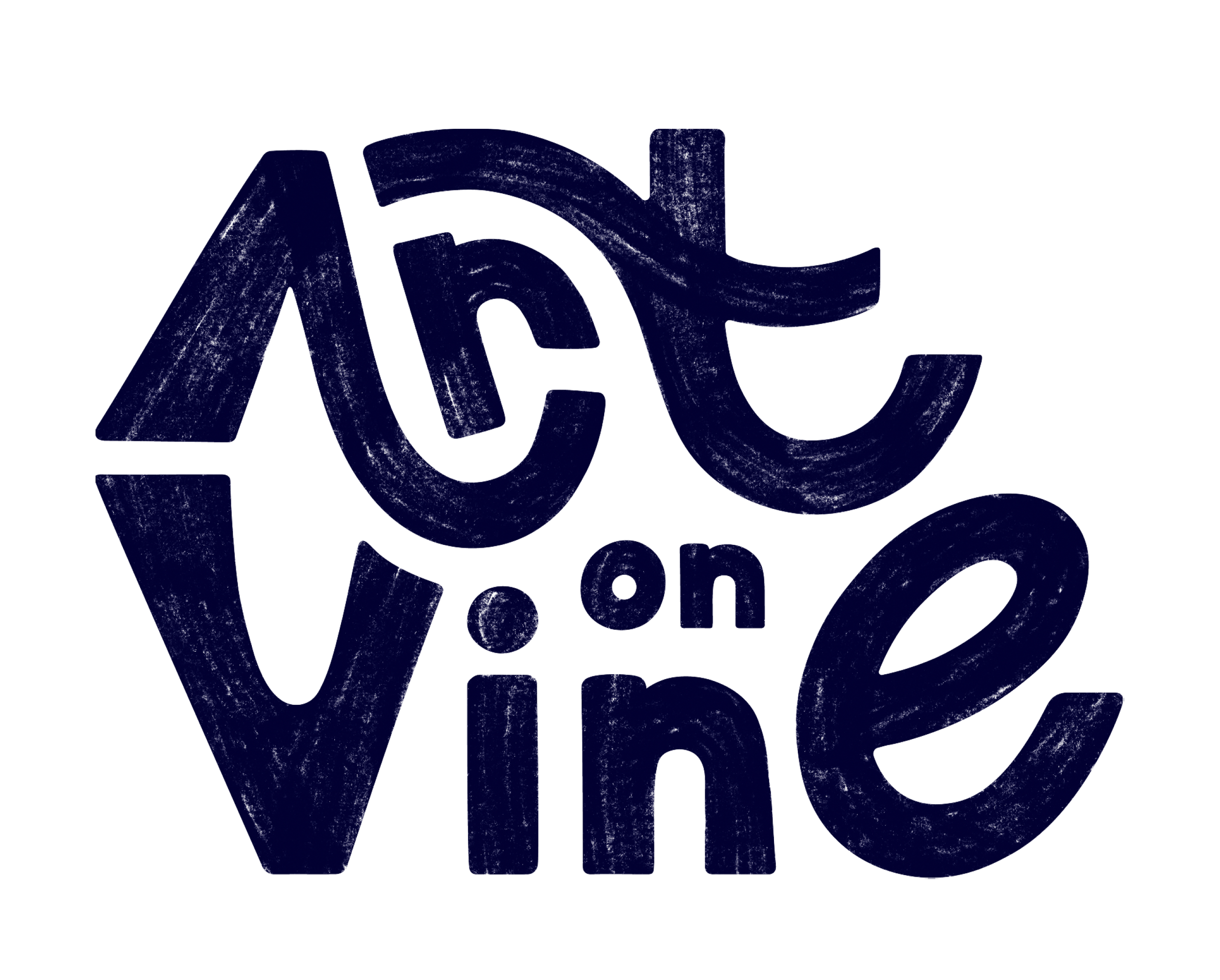
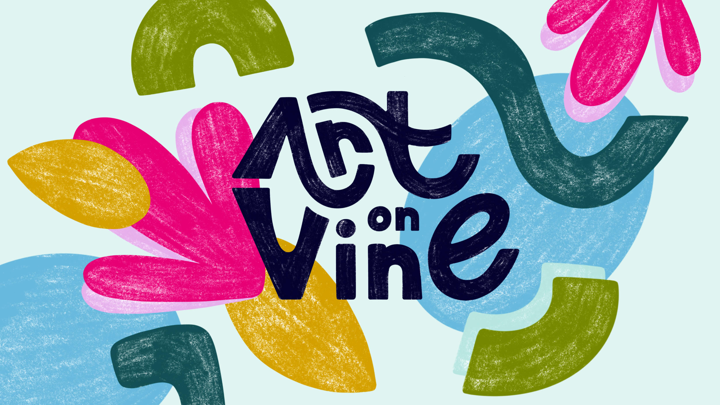
Final Wordmark and Rationale
Brand Identity Inspiration
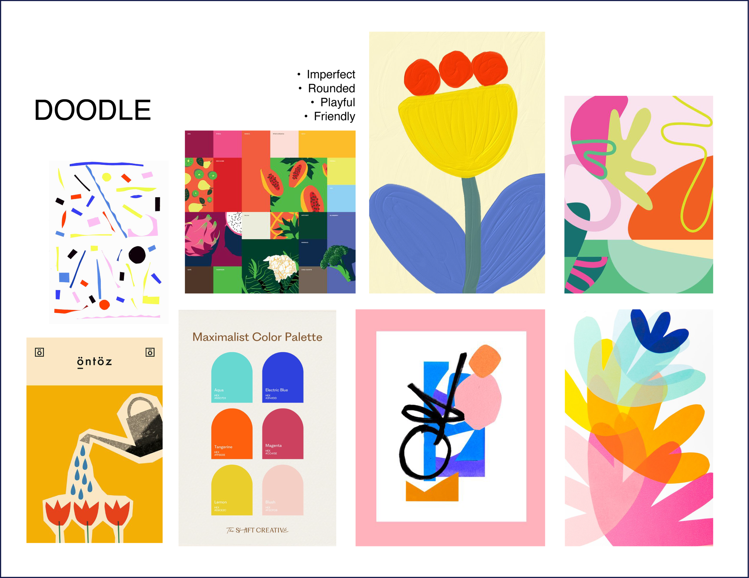


I struggled for a while with the shapes and colors feeling too “digital,” until I realized that what I was missing was painterly artistic texture.
Visual Element Iterations


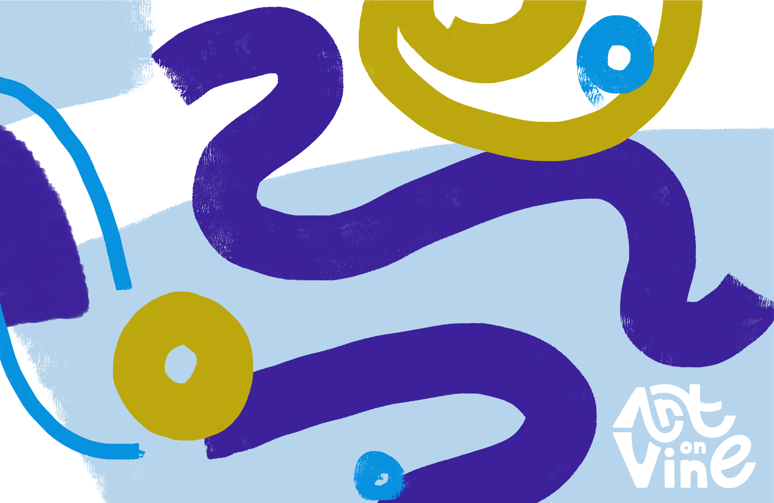


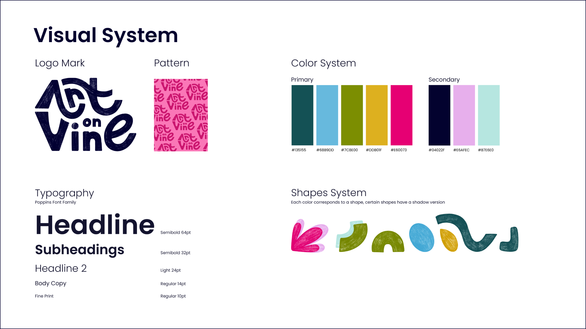
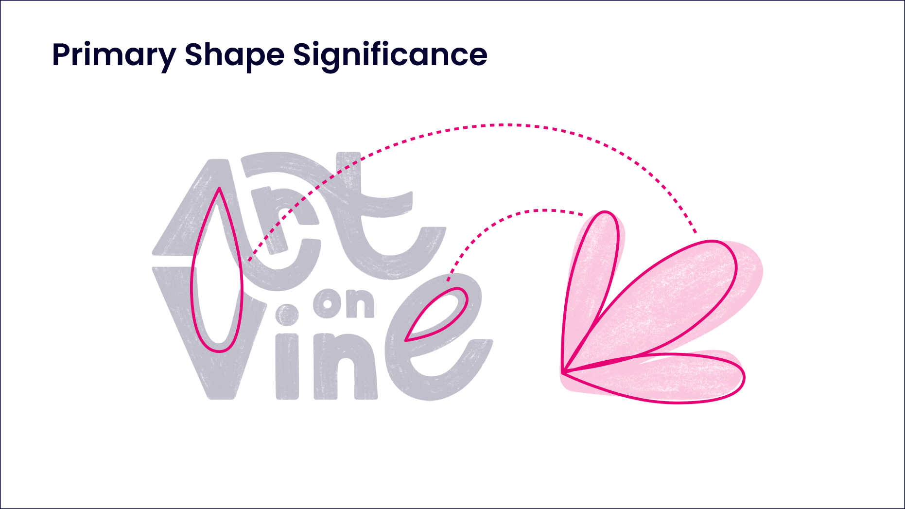
Final Visual System and Shape Rationale

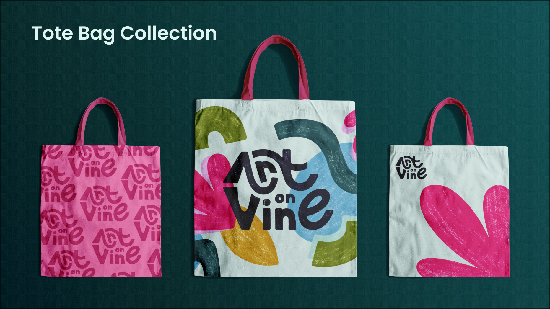
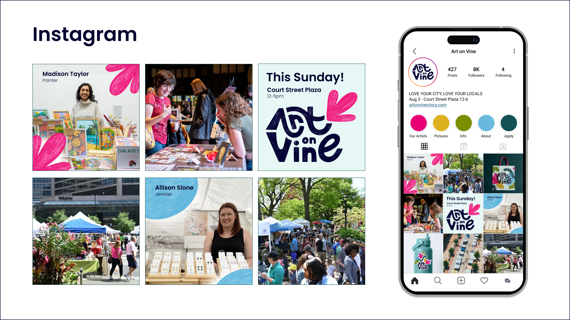
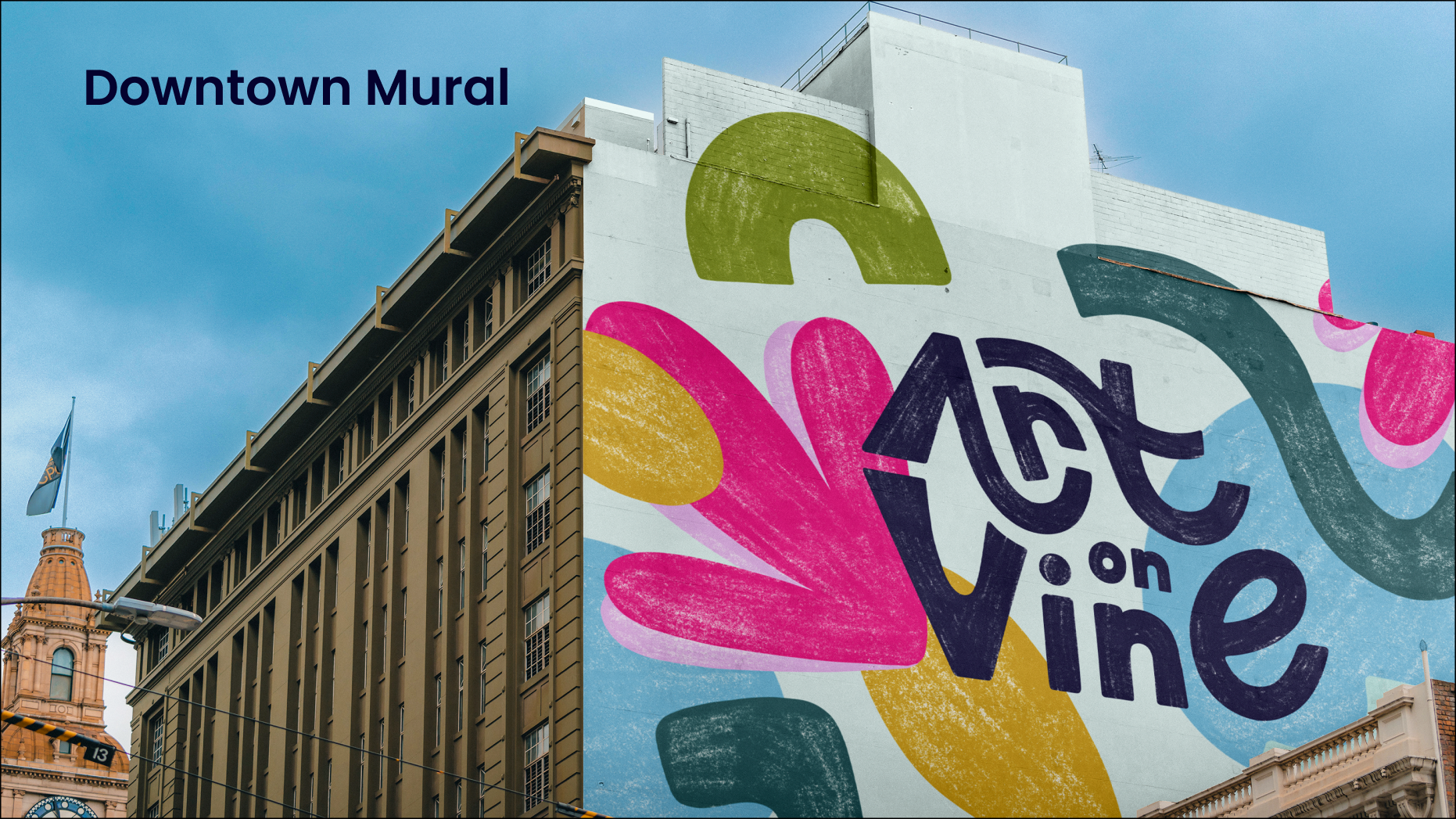
Touchpoints